Learning resources developed for Curtin University for the redesign of the Web Design 1 unit that was part of the Design Experience & Interaction Design major. Students took Web Design 1 to learn how to design, code and launch a HTML and CSS website from the ground up with no prior knowledge.
_Challenge_01/04_
Design students needed to be competent at more than just visual design and prototyping. They also needed to code to be competitively successful in the industry. But code was a particularly dry topic for them, with dry resources. Thus, in 2021 I was tasked to redevelop the Web Design unit to be more engaging and accessible to everyone regardless of prior knowledge.
_Solution_02/04_
Create resources that use humour, analogies and progressive disclosure to make a dry and challenging topic feel fun and easy to learn for beginner coders.
As the sole designer for this unit, I was responsible for the learning and content design. This included creating a repeatable design system for colour logic, typographical hierarchy, and pacing of each lesson.
Only small portions of the material can be shown here due to copyright.
_Process_03/04_
While I can't show data from Curtin here, I ran surveys and interviews with students to learn their pain points and needs. I had also taught the unit since August 2015, so the redesign was grounded in a wealth of real data.
The summary for these findings was that the material felt dry, CSS layout was confusing and topics were easy to get lost in. Humour and cute animals resonated well with students, and pre-recorded videos in addition to bite sized in class activities, helped further cement the concepts.
I worked backwards from that: what would a student need at each step to get from bored and confused, to actually enjoying the process and learning along the way.
Below are a few examples of decisions informed by this data and design principles:
Wayfinding and Visual Hierarchy
Each slide uses consistent header and font styles to anchor each topic, and indicates with italics where subsequent slides drill deeper into sub topics. This helps students know where they are in the material and how the rules relate. The colour choice (dark blue and white) create strong visual contrast without distraction from the content. These visual cues help students form clear mental models as they read.
Functional and aestheic colour
Coral text is used consistently to highlight key terms. Blue and coral are paired for code syntax: showing parent child code logic. This creates a scannable reading path for time poor students. Skimmers can get the gist of the rule, while readers can gain a full explanation. Not all learners can commit full attention all the time, so making the content scannable can improve accessibility. Slides still need to be aesthetically pleasing though, as this helps maintain engagement with the content. So colours were chosen to be contrasting while still remaining harmonious.
Scaffolding concepts with humour and metaphor
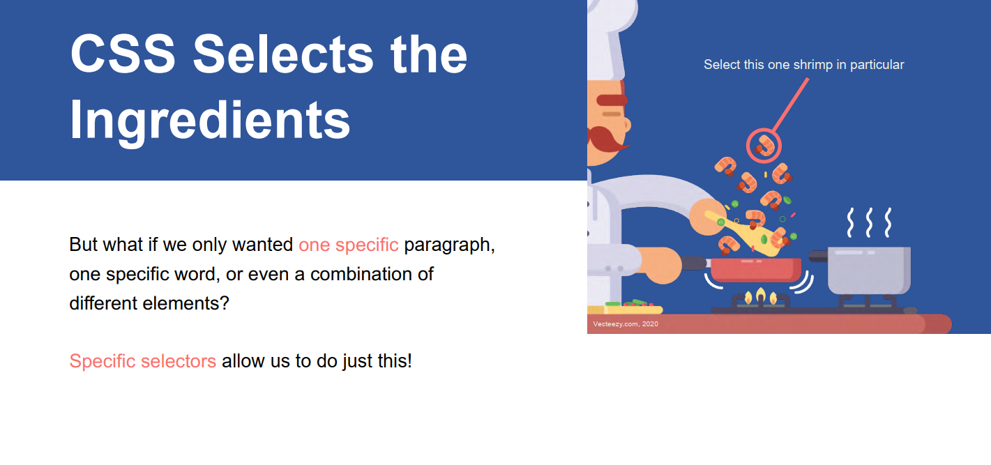
Abstract code concepts can be dry and cryptic at times. I translate these into everyday physical metaphors paired with matching illustrations, such as HTML as parts of a sandwich and CSS being the chef to select and perfect the ingredients. But sometimes, silly cat pictures or amusing imagery is needed for more advanced topics. Such as using the bodybuilders to demonstrate flexbox scaling, or squashing cat faces to explain flexbox's default behaviour. These things help build durable mental models for learners new to code logic, and can help better communicate to students not fluent in English.
Progressive Disclosure
I isolate one rule per slide. After each rule, the code syntax is shown and the way the browser renders it, often with some kind of visual joke or typical problem beginners encounter. After which, the solution is revealed. This step by step scaffolding helps ease cognitive load and improve stickiness of the learning, rather than just telling students the answer. I let them code along, break their layouts, and then explain to them what happened, and importantly why. That way students can start to posit their own fixes as they progress.
_Impact_04/04_
I saw higher class attendance and pass rates compared to previous years, and more creative and confident uses of code. Some students still called it one of the most difficult units they had taken, but also one of their favourites. Managing to create something both challenging and enjoyable felt deeply rewarding.
If you've hired a web or experience designer who graduated from Curtin between 2021-2025, it's likely I've taught them :)